menu
Close
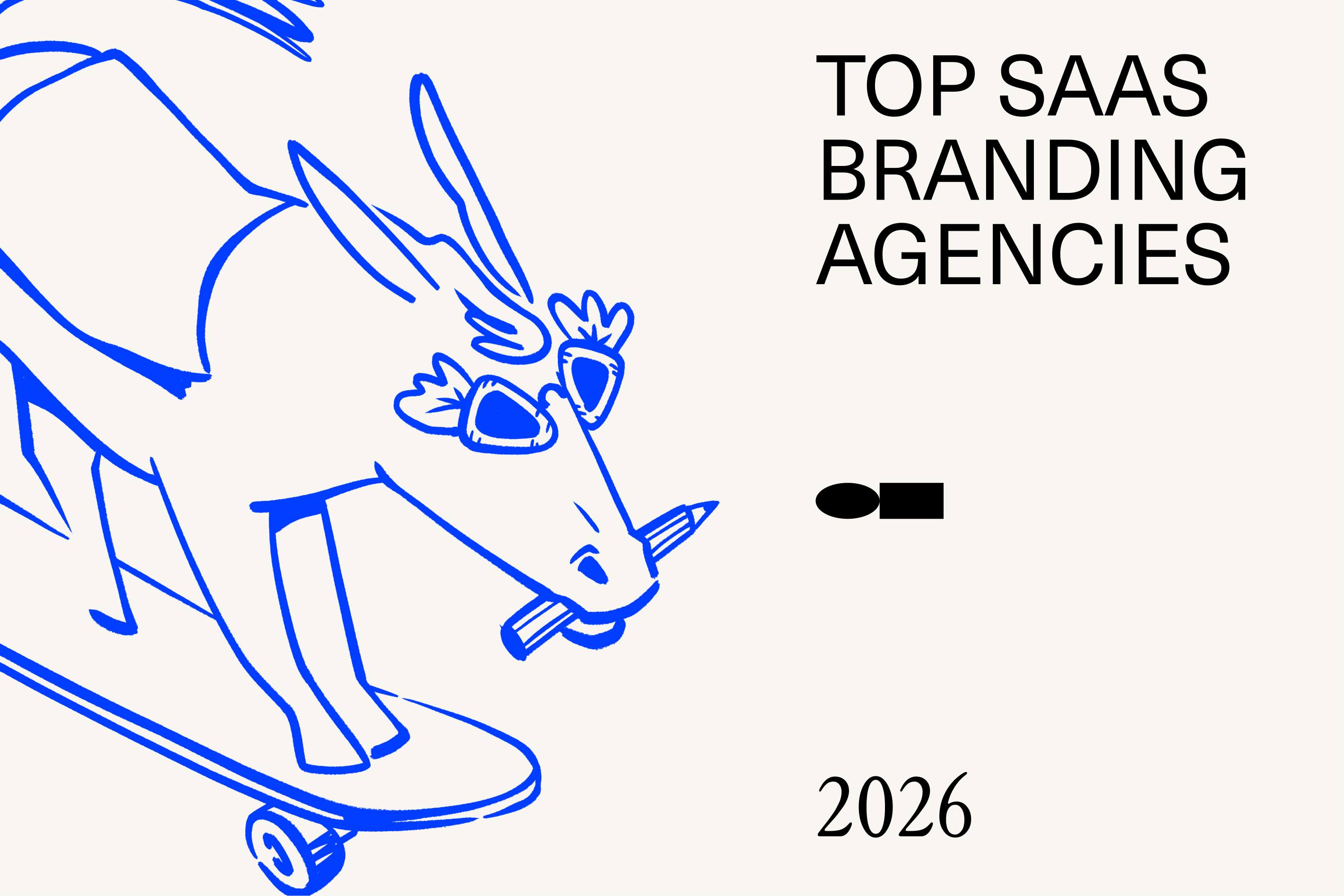
SaaS branding has a quiet problem in 2026: everything looks good, yet very little actually works.
Landing pages are polished. Logos are minimal. Product UIs are clean. But underneath the visual shine, many software brands struggle with the same issues, unclear positioning, generic messaging, and brand systems that fall apart once they hit real product and growth pressure.
This is where most branding agencies fail SaaS companies.
Designing for software isn’t about attractive identities or clever taglines. It’s about building brands that live inside products, scale across fast-moving teams, and clearly explain why this software exists in markets flooded with alternatives. That requires an understanding of UX, product storytelling, modern web systems, and how brands behave across real digital touchpoints, not just in pitch decks.
This list focuses on SaaS branding agencies that actually understand that reality.
The studios featured here work with startups and tech companies building complex products, launching new categories, or repositioning in competitive spaces. They think in systems, not slogans. They design brands that work across product, Webflow sites, motion, and marketing, not just presentations.
If you’re a software brand looking for a modern design partner in 2026, this guide is built for you.
In SaaS, good-looking brands are easy to find. Brands that actually work are not.
So we didn’t evaluate agencies based on trends, awards, or surface-level polish. Software companies need branding partners who understand product complexity, growth pressure, and the realities of digital-first ecosystems. That’s the lens we used for this list.
Here’s what mattered.
1. Product-first thinking, not brand theatre
We prioritised agencies that understand how brands live inside software, dashboards, onboarding flows, feature launches, and UX touchpoints. If an agency couldn’t demonstrate product awareness, it didn’t make the cut.
2. Clear positioning in crowded SaaS markets
SaaS categories are saturated. We looked for agencies that help brands articulate why they exist, who they’re for, and what truly differentiates them beyond vague value props and generic messaging.
3. Scalable systems, not one-off identities
Logos don’t scale, systems do. We favoured agencies that build flexible brand systems capable of evolving across product, Webflow sites, motion, and marketing as teams and products grow.
4. Proven work with startups and tech teams
We reviewed multiple case studies per agency, focusing on SaaS, tech, and startup clients. Consistency mattered more than a single standout project.
5. Digital execution that holds up in the real world
Mockups are easy. Live products are not. Agencies were evaluated on how their work performs across real digital environments, not just presentations.
6. Strategic depth behind design decisions
Strong SaaS branding requires reasoning, not aesthetics alone. We looked for agencies that clearly explain why they made certain choices, not just what they designed.
7. Ability to grow with fast-moving teams
SaaS companies evolve quickly. Agencies that showed adaptability, long-term thinking, and experience working with scaling teams ranked higher.
This evaluation framework helped surface agencies that don’t just make software brands look modern but help them function better, communicate clearer, and scale with confidence.
The agencies listed below were selected using the evaluation framework outlined above, with a clear focus on startup and SaaS realities, not surface-level aesthetics.
Each studio has demonstrated strong product-first thinking, the ability to build scalable brand systems, and experience working with fast-moving tech teams across digital-first environments. These agencies consistently show clarity in positioning, depth in strategy, and design execution that holds up beyond presentations.
Creative Mules is an Amsterdam-based branding and Webflow studio known for pairing strategic clarity with clean, modern visual execution. The studio operates as a small, independent team supported by a flexible network of collaborators, allowing them to deliver high-quality branding and website projects without the overhead of a large agency.
Their work spans brand strategy, identity systems, UX/UI, and Webflow development, making them a strong fit for startups and SaaS companies that need both a well-defined brand and a functional, conversion-focused marketing site. Project budgets vary based on scope, with engagements typically ranging from smaller identity builds to more involved brand + website rollouts.
A complete website project showcasing a modern, clean digital presence with strong use of typography and grid-based layouts. The work demonstrates Creative Mules’ ability to design a premium marketing site and build it in Webflow with performance and clarity in mind.
A full identity and website project where Creative Mules developed the brand system and applied it across digital touchpoints. The case highlights their capability to create a cohesive brand language and translate it into a functional, visually consistent website.
.png)
Kurppa Hosk is a Stockholm-based brand and design studio founded in 2009, known for its ability to combine strategic clarity with strong, contemporary visual identities. The studio works across brand strategy, identity, and design systems, helping organisations define who they are and how they show up across digital and physical touchpoints.
With a collaborative, strategy-led approach, Kurppa Hosk partners with both global brands and growing companies to create identities that feel clear, confident, and adaptable. Their work often balances bold visual expression with structure and restraint, making it practical as well as distinctive.
Kurppa Hosk is particularly well suited for brands that need a strong identity foundation that can scale across markets, platforms, and audiences without losing consistency.
Kurppa Hosk worked with Bobbi Brown to evolve the brand’s visual identity, bringing greater clarity, confidence, and consistency to its global presence. The project focused on refining how the brand communicated its values across packaging, digital channels, and brand communications.
The updated identity balanced modernisation with familiarity, ensuring the brand remained recognisable while feeling more contemporary and relevant.
Kurppa Hosk partnered with Meta on brand-related design work focused on clarity, structure, and consistency across communication touchpoints. The project required a flexible design system that could support a large, complex organisation while remaining clear and accessible.
The studio’s work emphasised scalability and usability, ensuring the design system could be applied across teams, products, and global markets.
Build in Amsterdam is a digital-first design studio founded in 2014 and based in Amsterdam. The studio is known for blending strong visual identity with product thinking, UX design, and eCommerce-focused digital experiences. Their work often sits at the intersection of brand, interface design, and technology.
With a multidisciplinary team of designers, developers, and strategists, Build in Amsterdam partners with brands that care deeply about how design functions in real-world digital environments. Rather than treating branding and digital as separate disciplines, the studio approaches design as a system that must work cohesively across websites, products, and platforms.
Build in Amsterdam is particularly well suited for brands that need design-led digital experiences, especially in commerce, lifestyle, and consumer-facing industries, where performance and aesthetics need to coexist.
Build in Amsterdam partnered with Polaroid to redesign and evolve its global eCommerce experience. The project focused on translating Polaroid’s iconic brand into a modern, digital-first platform that could support both storytelling and conversion.
The studio developed a flexible design system that balanced nostalgia with contemporary usability, ensuring the site could scale across products, campaigns, and international markets.
For Alpine, the high-performance automotive brand, Build in Amsterdam designed a digital experience that reflected speed, precision, and engineering excellence. The project focused on creating a visually striking yet highly usable interface that aligned with Alpine’s performance-driven identity.
The work combined strong visual storytelling with structured UX, resulting in a digital platform that supported brand expression while remaining functional across devices.
Koto is a global branding studio known for building bold, contemporary identities for some of the world’s fastest-growing companies. Founded in 2015, the agency has quickly expanded into a multi-office international studio working across London, Berlin, Los Angeles, New York, and Sydney.
Koto specializes in high-growth brand environments, from tech startups to established global consumer brands with a strong emphasis on clarity, personality, and modern expression. Their work spans strategy, naming, identity, digital design, and brand voice, often helping companies establish a differentiated market position at pivotal moments of growth.
Koto partnered with Amazon to develop brand systems that support clarity and consistency across a complex, global ecosystem. The work focused on creating flexible design frameworks that can scale across products, teams, and touchpoints while maintaining a coherent brand experience.
Koto worked with Workday to evolve the brand’s visual identity and digital expression as the company continued to scale. The project centred on building a clear, adaptable system that supports a wide range of product and marketing needs while reinforcing Workday’s positioning as a trusted enterprise platform.
Studio Dumbar (part of DEPT®) is a pioneering Dutch design agency known for bold, expressive visual identity work and a strong emphasis on motion and digital-first design. Founded in the 1970s, the studio has been instrumental in shaping modern European graphic design through experimental, culturally influential work for public institutions, technology companies, and international brands.
The studio is recognised for its craftsmanship in visual identity systems, its high-impact motion brand expressions, and its contemporary approach to digital branding. Now part of DEPT®, Studio Dumbar combines its iconic design heritage with the capabilities of a global digital network.
Studio Dumbar created a bold, expressive visual identity and motion-led design system for Amsterdam Sinfonietta, showcasing their ability to merge classical culture with cutting-edge digital expression.
One of Studio Dumbar’s most iconic nation-scale identity projects, a complete redesign of the Dutch Police visual system, setting a benchmark for clear, functional, large-scale public branding.

Anton & Irene is an independent design studio known for crafting bold, experimental, and visually distinctive digital brand experiences. Founded by Anton Repponen and Irene Pereyra, the studio has built a strong reputation for pushing creative boundaries while maintaining clarity and purpose in brand expression.
Their work often lives at the intersection of brand identity, interaction, and storytelling, with a strong emphasis on the web as a primary brand surface. Rather than delivering conventional corporate branding, Anton & Irene focuses on expressive digital systems that help brands stand out culturally and visually making them especially relevant for startups and scale-ups looking to differentiate in crowded markets.
The studio operates with a small, senior-led team and takes on a limited number of highly crafted projects. Engagements are typically concept-driven and design-led, resulting in brands that feel distinctive, memorable, and digitally native.
Anton & Irene designed a digital experience for Spotify that explores music through interaction, motion, and visual storytelling. The project focuses on translating Spotify’s music-first identity into an immersive web experience that feels expressive, dynamic, and emotionally engaging, while staying true to the brand’s core simplicity.
Anton & Irene created the digital platform for Design Beyond Barriers, an initiative focused on inclusive and accessible design. The work combines content, interaction, and thoughtful visual design to communicate complex social themes in a clear and engaging way, ensuring accessibility is embedded into both the message and the experience.

DesignStudio is a global branding agency founded in 2009 and known for its bold, expressive identity systems and high-impact brand storytelling. Operating across London, Sydney, San Francisco, and Shanghai, the studio partners with ambitious companies looking to redefine their category, express a clearer purpose, or scale their brand globally.
Their multidisciplinary team blends strategy, design, and motion to create brand experiences that work across digital products, physical environments, and global communication campaigns. From hyper-growth startups to global household names, DesignStudio is recognised for brand transformations that feel energetic, modern, and culturally relevant.
DesignStudio created the now-iconic Airbnb “Bélo” identity, repositioning the platform around the idea of belonging. The project included strategy, brand identity, motion, product design, and a global brand system.
The agency redesigned Deliveroo’s identity to introduce a bold new logo, colour system, and visual language built for scale across delivery gear, restaurants, packaging, and digital products.
Bold Scandinavia is a Stockholm-based brand and design studio founded in 2013, known for its sharp strategic thinking and clean, confident Scandinavian design sensibility. The studio focuses on building clear brand identities and systems that help modern companies communicate more effectively as they grow.
With a strong emphasis on positioning, identity, and visual clarity, Bold Scandinavia works closely with founders, leadership teams, and product teams to define brands from the inside out. Their approach balances strategy and design, resulting in identities that feel focused, intentional, and easy to apply across digital and physical touchpoints.
Bold Scandinavia is particularly well suited for startups and growth-stage companies that need clarity, structure, and a strong brand foundation without unnecessary complexity.
Bold Scandinavia partnered with Fello, a Swedish telecom brand, to create a clear and approachable brand identity in a highly competitive market. The goal was to position Fello as a modern, transparent alternative to traditional telecom providers.
The studio developed a visual identity and brand system that emphasised simplicity, warmth, and clarity, helping Fello stand out while remaining easy to recognise and apply across digital channels.
For Arrive, a digital logistics and mobility-focused brand, Bold Scandinavia designed a brand identity that reflected reliability, movement, and efficiency. The work focused on creating a flexible system that could scale alongside the company as it expanded its services and markets.
The resulting identity balanced functional clarity with a confident visual presence, supporting Arrive’s positioning as a modern, dependable platform.
Ustwo is a global digital product studio known for designing products and experiences that balance usability, craft, and human-centred thinking. Their work often sits at the intersection of product, brand, and service design, helping organisations turn complex challenges into clear, intuitive digital experiences.
Rather than positioning themselves as a traditional branding agency, ustwo approaches brand expression through product behaviour and interaction design. This makes them particularly effective for organisations where brand perception is shaped primarily through apps, platforms, and services rather than marketing-led touchpoints. With a strong culture of experimentation and social impact, ustwo frequently partners with both global brands and early-stage ventures to explore new ideas and build products that scale.
For Samsung, ustwo partnered on designing digital experiences that shape how users interact with the brand across devices and platforms. The challenge was to translate Samsung’s scale and technological ambition into interfaces that feel intuitive, human, and consistent despite the complexity of its product ecosystem.
ustwo focused on interaction design, usability, and system-level thinking, ensuring that brand values such as innovation, reliability, and accessibility are expressed through everyday product behaviour. Rather than relying on overt visual branding, the work embeds brand perception into how products function and respond. This project highlights ustwo’s strength in delivering branding through experience where consistency and clarity across interactions define the brand more than static assets.
For Peloton, ustwo worked on enhancing the digital product experience that sits at the core of the brand’s relationship with its users. The challenge was to support a premium, motivational brand promise while designing experiences that scale across workouts, devices, and user journeys.
Ustwo approached the project through service and product design, aligning interface decisions with Peloton’s tone, energy, and community-driven ethos. The resulting experience reinforces brand trust and emotional connection through usability, pacing, and interaction, not marketing language. This work demonstrates how ustwo helps brands express identity through behaviour, making product experience the primary carrier of brand value.

R/GA Europe is the European arm of R/GA, a global creative and innovation company known for building brands at the intersection of design, technology, and business. The studio approaches branding as a dynamic system shaped by product experience, storytelling, and digital interaction rather than static identity alone.
R/GA’s work is particularly strong for technology-led organisations where brand expression needs to scale across platforms, products, and global markets. Their branding and creative work often blends strategic positioning with experience design, helping complex products feel human, coherent, and culturally relevant.
Operating with multidisciplinary teams across strategy, design, and technology, R/GA Europe is well-suited to well-funded startups and scale-ups that require enterprise-grade thinking, global brand consistency, and future-facing creative systems.
R/GA partnered with Google to lead the global brand redesign of Android, focusing on clarifying the platform’s identity while preserving its openness and flexibility. The work centred on building a cohesive brand system that could scale across a complex ecosystem of devices, manufacturers, and markets, while remaining recognisable and human-centred. The redesign translated Android’s technical depth into a clear and approachable brand experience across product marketing, digital platforms, motion, and global communications. The result was a unified system that balanced consistency with adaptability, allowing Android to express a stronger, more confident identity across its expanding global footprint.
For Google Play, R/GA developed brand and creative experience work aimed at evolving the platform’s visual expression and storytelling. The project focused on creating a flexible brand system capable of supporting a diverse global marketplace of apps, games, and digital content, while maintaining clarity and cohesion. The work helped define how Google Play shows up across campaigns, digital touchpoints, and promotional experiences, ensuring consistency without limiting creative variation. By strengthening the platform’s brand framework, R/GA enabled Google Play to communicate discovery, creativity, and trust at scale across regions and formats.
Scaling a SaaS product is hard. Scaling a brand that wasn’t built for growth is harder.
Founders usually feel it first: constant tweaks to messaging, redesigns that don’t fix the real problem, and a growing gap between what the product actually does and how it’s presented to the world. The brand starts lagging behind the product.
This is the point where choosing a branding agency stops being a subjective decision and becomes a strategic one.
The wrong partner won’t just waste time, they’ll lock you into a system that doesn’t scale. The right one will help future-proof your brand, giving you clarity, flexibility, and consistency as your product, team, and market evolve.
Here’s what to look for when choosing a startup or SaaS branding agency in 2026:
1. Choose an agency that understands how startups evolve
Your brand shouldn’t be rebuilt every time your roadmap changes. Look for agencies that design flexible systems, ones that can stretch from early-stage positioning to scale without constant rework.
2. Prioritise product understanding over visual style
If an agency can’t explain your product clearly, they won’t be able to brand it well. Strong partners ask hard questions about user flows, onboarding, and value moments, not just colours and logos.
3. Look for clarity in positioning, not clever language
Startups don’t need poetic brand statements. They need sharp answers to simple questions: Who is this for? Why does it exist? Why should anyone switch? Agencies that avoid these questions usually hide behind aesthetics.
4. Evaluate how their work performs in real digital environments
A brand that looks great in a deck but struggles on a website, inside a product, or across motion and marketing is a risk. Check how their work behaves in live SaaS products, not just mockups.
5. Match the agency to the stage you’re actually in
Early-stage startups need focus and speed. Growth-stage companies need structure and scalability. Not every agency is built for both. Choose one that aligns with where you are now and where you’re going next.
6. Pay attention to how they communicate under uncertainty
Startup branding is messy by nature. You want an agency that can navigate ambiguity, challenge assumptions, and help you reframe the problem when things aren’t clear.
7. Look for partners, not production vendors
The right agency won’t just execute instructions, they’ll help you think better. They’ll push back when something doesn’t serve the product or the user, and they’ll care about outcomes, not just deliverables.
The best branding agencies don’t just make companies look modern. They help brands evolve alongside the product, the team, and the market without losing clarity along the way.
The real risk for SaaS companies in 2026 isn’t having a bad brand.
It’s having a brand that can’t keep up.
As products evolve faster, teams scale quicker, and markets get noisier, branding stops being a visual exercise and starts becoming infrastructure, something that either supports clarity and growth or quietly creates friction across product, marketing, and sales.
The agencies featured in this list understand that difference.
They don’t design for launch day. They design for what happens after, when features expand, messaging shifts, and the brand needs to stretch without losing coherence. For software companies, that ability matters far more than surface-level aesthetics.
If your product has outgrown its original positioning or your brand feels a step behind what you’ve built, the solution isn’t another redesign. It’s choosing a partner who understands how SaaS brands evolve and can build something that grows with you.
For SaaS companies, strong visuals are expected.
What’s harder and far more valuable is a brand that actually supports how the product grows.
As software evolves, branding needs to do real work: clarify complex offerings, align fast-moving teams, and stay coherent across product, website, and marketing. At this stage, branding isn’t about looking modern, it’s about removing friction and creating consistency where things tend to break.
The right branding partner helps you think clearer, not just look better. They understand your product, challenge weak assumptions, and build systems that can be used, extended, and trusted as the company scales, not just presented once and forgotten.
That’s the kind of work we focus on at Creative Mules.
We work with startups and SaaS teams who’ve outgrown surface-level branding and need structured brands that live inside products, scale across modern digital ecosystems, and hold up long after launch.
If you’re looking for a branding partner who:
Then we might be the right fit for your project. Schedule an intro call with Creative Mules
.png)
.png)
-(1).png)